
Responsive Educational Website by " Rohith "
⏩ Before we start building a website , let us discuss the differences between Static , Dynamic and Responsive websites . And some Important steps .

Differences between Static , Dynamic and Responsive Websites
1. Static Website

1. Static Websites are also known as fixed websites that are the most simplistic websites which contains web pages which has fixed content . That means their content do not change depending upon the user .
2. Static websites are built using simple HTML code and display same information to every user . The codes are fixed to each page so the information provided on the page does not change unless it is manually updated . Generally static websites are cheaper and easier to create .
3. Resizing the browser or viewing it on different devices won't affect the way website looks . These websites have a set of width and require horizontal scrolling .
2. Dynamic Website
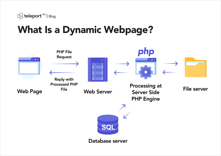
1. Dynamic Websites are also known as fluid websites contains dynamic web pages that are generated in real time . This means that the web pages will display different content each time the site is visited . These pages include web scripting code , such as PHP , ASP ,& JSP .
2. Dynamic pages access information from a database . Hence , webmaster may only need to update the database record in order to alter the content of dynamic pages . Unlike static websites , dynamic websites have more personal and interactive user experience .
3. These websites take slightly slower time to load in comparison to static as they are little more complex to develop . Dynamic websites look same in terms of proportions no matter what the screen size .
3. Responsive Website

1. There is another type of websites which is widely used in these days . The websites which are built with percentages instead of exact measurements . These websites are called as Responsive Websites which are optimized for smartphones and tablets . Responsive websites used actually look different on each device . The elements stretches or shrinks according to the screen size . These websites are built using a mobile-first approach .
2. A large proportion of the users use mobile phones to view the site . Therefore most of the companies nowadays opt for responsive web design services , whether they work on small scale or large scale as it offers best experience to such users .
[ Now let's create our educational website ]
Website name : " RohithTech-Educa " ___( HTML - 5 , CSS - 3 , JavaScript )
⏩ Here we are using HTML , CSS , JavaScript for building our website , of course it is not dynamic website but in future I'll be uploading that too . It is a responsive website which can be easily accessed through computer , tablet and mobiles .
[ Here we are using VS Code & Some Important steps to follow ]
Step - 1 : [ Creating pages in VS Code ]
⏩ Open up your VS Code Editor and create the following files :
- Create a Main Homepage for your website i.e landing page with .html file extension .
- Create a Courses , Blog , About , Contact files with .html file extension .
- In Blog Section , we create 4 blog posts i.e Post 1 , Post 2 , Post 3 , Post 4 in .html extension .
- In Courses Section , we create 10 course posts i.e CPost 1 , CPost 2 , CPost 3 , CPost 4 , CPost 5 , CPost 6 , CPost 7 , CPost 8 , CPost 9 , CPost 10 .
- Then we use JavaScript and jQuery with .js extension
- Apart from these the most important file is CSS ( Cascading Style Sheets ) .
Step - 2 : [ DOM - Manipulation ]
1. Write the HTML Code in the DOM manipulation because the browser is designed in a way to understand the code easily load the page fastly . Import the necessary CDN ( Content Delivery Network ) code to implement in your website . Like we use font awesome for different types of icons , Bootstrap for easy responsive website without media queries , AOS animations for beautiful animated website when scrolling etc .... These are the few CDN's that I use in a basic responsive website .
Step - 3 : [ Search Engine Optimization ]
1. Always try to reduce your code and give better output , likewise some websites use too much JavaScript code which is not necessary and CSS too . By this the website takes longer time to load your site in search results , Therefore it affects your ranking in search results .
2. SEO [ Search Engine Optimization ] is the important key for your web pages to build a website , it plays a key role in ranking of your website .
3. At last , Build your web pages in a SEO way to rank in search results . And use less code with better output .
Step - 4 : [ Resizing Images ]
1. When you are placing or posting a image or video thumbnail in your post try to reduce the size of the image , this is because when you try to load a website it takes a time to load your images and then open your website , this is time consuming and many people frustrate of not opening the site but taking up so much internet . That's because of loading images on your site .
2. Therefore , to reduce the page loading of your website make sure to resize your images and thumbnails . Here is the link to reduce your images ---- ( Online ) https://resizing.app/ ( clickable link )
3. Use the above link to resize your images . Average image size should be min 20 - 50 kb .
Step - 5 : [ Core Web Vitals ]
⏩ Core web vitals plays an important role in speed indexing of your site as well as faster loading of your site . Core web vitals is google's experience signal and is an effort to place an importance on site usability and user experience using several predefined metrics .The metrics making up core web vitals include :
- LCP [ Largest Contentful Paint ]
- FID/FCP [ First Input Delay / First Contentful Paint ]
- CLS [ Cumulative Layout Shift ]
LCP measures the timing for a browser to render the largest text or image block in the viewport . LCP should occur within 2.5 seconds of when the first page begins loading to provide good user experience . Improving LCP come down to Critical CSS and asynchronous asset loading , Optimizing Images , Reducing Server Response time .
FID / FCP metric helps us to measure your first impression of your site's interactivity and responsiveness looks at how fast your page loads combined with how quickly a user can interact with the page . To provide a good user experience , sites should strive to have FID of less than 100ms , we will also want to be mindful that FCP on additional metric that falls under FID , which measures how fast your page loads .
- Eliminate render-blocking resources .
- Leverage browser caching .
- Reduce server response time .
- Optimize code coverage .
- Minify .
- Utilize lazy loading .
CLS is the stability measured which looks how a page moves around when loading . CLS can cause users to clock on things they do not intend to and is often a publisher tactic to get user to click on ads . To provide good user experience , pages should maintain a CLS of less than 0.1 .
Improving CLS comes down to :
- Including image size attributes .
- Carefully inserting content .
- Animating using CSS transformations .
Where to find your website scores ?
⏩ Marketers and Developers can see how their website stacks up in a couple of different ways . Most easily , Google provides you a free " Page Speed Insights " or other third party websites like " GT Metric " .
Here are the links for Page Speed Insights and GT Metric :https://pagespeed.web.dev/ ----- ( clickable link ) --- page speed insights
https://gtmetrix.com/ ----- ( clickable link ) --- GT Metric
RohithTech-Educa Web Design [ Images ]
1. HTML Files :


( Blog Post 4 )

( Course Post 1 )


( Course Post 6 )

( Course Post 7 )


jQuery File [ Download / CDN ]

CSS File

⏩ [ Therefore these are the Website code images and the images that include in the website need to be separately downloaded or I'll provide in the GitHub , do check it out ]
Website Images and source code are provided in the GitHub , Link is provided below .
Output of the website :
1.

2.

3.

4.

5.

6.

⏩ ( Therefore these are the outputs of the " RohithTech-Educa " website ) , I hope you understand the concept of creating the responsive website on your own .
⏩ As many you say that , you can create a website without coding , there are many websites that creates for you - I agree ....But you should know the concept behind this ..
⏩ In future , I'll be uploading the dynamic website where you can enter your details , and fetch the data in the database using Node JS and PostgreSQL .
===== GitHub Link : =====
Source Code :
( clickable link )
==== FOR MORE INFO : ====
Email :
( clickable link )


No comments:
Post a Comment